As Levi Strauss & Co. pivots to becoming a DTC-first retailer, teams throughout the company are focused on ensuring we meet our fans wherever they like to shop and delivering a best-in-class experience on all our channels. We know the stakes are high — after all, 71% of consumers are channel agnostic, and over 80% say that the experience is as important as a company’s product or service — so we know we need to get it right, on all our channels. That includes e-commerce, a channel that has been growing at a healthy pace in recent years — it grew 13% last year, and has strong momentum in 2024, up 19% in the second quarter led by double-digit growth in the U.S.
This growth is thanks in large part to the teams being laser-focused on improving our digital fundamentals, particularly in two key areas: site experience and product storytelling.
Site Experience: Speed, Search, Navigation
As teams got to work this past year on enhancing our overall site experience, they drilled down into the three foundational components that make up a best-in-class retail site: site speed, search and navigation.
Site speed is a key driver for conversions, and seconds matter — just a three-second delay can cause consumers to drop from the site. Knowing this, our digital team has spent the last year overhauling our rendering model, shifting from predominantly client-side rendering to a hybrid model that combines server-side and client-side rendering. This both significantly improves page load times and our SEO ranking, helping bring even more consumers to our site. The teams updated the site’s loading components as well, ensuring that only the necessary components load at any given time to further optimize the loading process. They also created a team focused on site performance that pushes site updates and releases twice a week — down from every three weeks — and runs performance tests in tandem, identifying issues and pushing fixes live quickly.
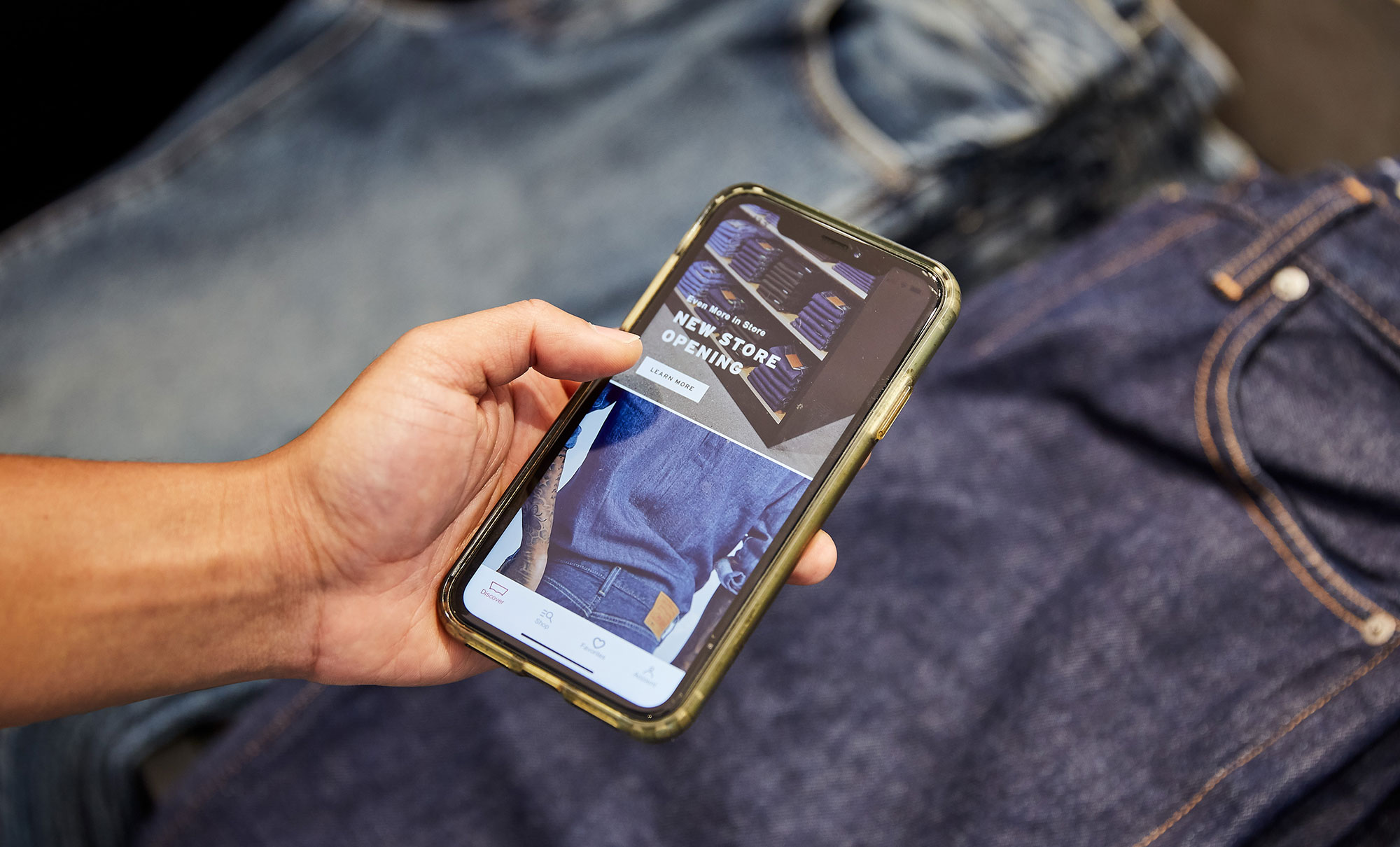
These enhancements have paid off in a big way — the site speed has improved by over 40% in the last year, and the app launch time has improved 50%. This foundational work is just the beginning, too, with teams identifying new opportunities to enhance the site experience even more now that the building blocks are in place.
The second core component to a good retail site is search — after all, a consumer can’t purchase a product if they can’t find it. To make sure this never happens to our fans, we partnered with a leading third-party vendor to implement a new search solution that shows our consumers more appropriate search results based on their search terms. This allows them to find products more quickly and easily, and turn those search results into purchases. This new search engine has driven a 10% improvement in search to product rate to date.
The third area the team has been working on is navigation. They wanted to make sure that the site’s navigation reflects both how consumers shop and how they expect to shop on the site, so they focused on truly understanding the consumer mental model. The product and UX leads dug into site analytics to look at the consumer journey on the site and partnered with our Consumer Insights team to hear from consumers directly. They then used these insights to reorganize the navigation options to better match consumers’ expectations. For example, many consumers said they expected to see products grouped by gender first, then category — now, the site navigation matches that expectation.
“We were committed to listening to and learning from our consumer from the start. They were our North Star, we always knew to come back and align around their expectations and needs,” explained Jason Sack, director of UX Design at LS&Co. “By maintaining this level of consumer obsession, we’re able to both create an easier shopping experience for our consumers and drive meaningful results for our business.”
The result of this consumer obsession? 20% more consumers getting to a product detail page.
Product Storytelling: Enhanced Imagery, Fit Features and Video Walkthroughs
Like all omni-channel retailers, we use all our channels to showcase the best possible representation of our products so that all our fans understand how our products can fit into their wardrobes and lives. We have a wide assortment of product available on our e-commerce channels, and we want to make sure our fans can always find their perfect fit, without having to try on the product. We’ve heard from our consumers that they care most about three features — rise, fabric stretch and leg opening. To address this, the team rolled out product highlights earlier this year for these three features so that consumers more quickly and easily spot the perfect fit for them.
Another way we’ve improved our product storytelling is through elevated product imagery and videos. For example, this year we rolled out elevated denim lifestyle imagery for women, which feature head-to-toe images that show women how they can incorporate our denim lifestyle products into their own, unique style. We’ve also added dynamic walk-on and walk-off videos for select products on our site, which let consumers better understand the product’s look and fit. Both have been successful additions to our site, generating increases in our add-to-cart numbers.
“We are constantly innovating and experimenting to deliver the best e-commerce experience for our fans,” said Priya Buening, VP of U.S. e-commerce at LS&Co. “We are proud of the progress we have made in improving our site speed, search, navigation and product storytelling, and we are excited to continue to enhance our digital capabilities and offerings. Our e-commerce channel is a key pillar of our DTC-first strategy, and we are committed to meeting our consumers wherever they shop and exceeding their expectations on all our channels.”


